National single-family rental platform · UX strategy · Search
Reframing property search to capture more renter intent
How I connected behavioral data, geographic exploration, and conversion strategy into a search experience the client moved into product development.
The platform manages and leases single-family homes across dozens of U.S. markets. It was attracting substantial renter interest, but people were losing momentum between search, geographic exploration, individual homes, and application. I found that four apparently separate page problems were one orientation problem, and turned that into a connected search and location strategy.
- Role
- Senior Experience Designer
- Duration
- Approximately 2 months
- Focus
- UX strategy · CRO analysis · property search · location discovery · strategic wireframing
- Outcome
- Recommendations adopted, prototyped, and moved into implementation by the client's internal team
Where the momentum went
High intent existed. The system was losing it between the moment renters started exploring and the moment they could commit to a home.
- {{ step.kicker }} {{ step.label }} {{ step.note }}
The sharpest loss sat between engaging with search results and opening a single home. Everything in this case study follows from that gap.
The 60-second version
- The problem
- The site attracted substantial renter interest, but high-intent visitors were losing momentum between search, geographic exploration, individual homes, and application.
- I owned
- UX and CRO analysis, FullStory and funnel analysis, heuristic evaluation, comparator research, approximately 80% of the engagement's core recommendations, all UX wireframes shown here, the client presentation, and the UX review of the search proof of concept.
- The pivotal insight
- Search, navigation, location content, and listing pages were not four separate UX problems. They were different expressions of the same need: renters had to remain oriented while exploring changing inventory.
- What changed
- The client approved the direction, organized the recommendations into phased releases, and developed a search proof of concept incorporating major recommendations including full-screen mobile search and user-defined geographic boundaries.
My scope
I owned
- Renter-journey audit
- FullStory behavioral analysis
- Funnel analysis
- UX and CRO analysis
- Heuristic evaluation
- Competitor and comparator research
- Prioritization of UX opportunities
- Approximately 80% of the engagement's core recommendations
- All UX wireframes shown in this case study
- Lower- and higher-effort homepage directions
- Navigation and location strategy
- Client UX presentations
- Review of the client's search proof of concept
- Next-phase UX recommendations
Collaborators
- SEO team
- Marketing strategy lead
- Client product team
- Client development team
Implementation
The client's internal product and development teams owned implementation. The strategy lead presented the opening portion of the initial proposal; after that, I owned client presentations for the UX direction and wireframes.
The site had demand. The experience was losing momentum.
Converting renters who were already on the site mattered more than acquiring new ones. The stakes were occupancy, time on market, and how efficiently the platform used the traffic it was already paying for. During the project period, the audit found the site's overall conversion rate below the industry benchmark available in the project data.
That benchmark framed the opportunity. It is project-period audit data, not a measure of anything the work later achieved.
The biggest opportunity appeared before renters ever reached a home
Nearly 60% of visitors who engaged with search results did not progress to a listing detail page.
This did not necessarily signal low intent. Session behavior also showed renters changing among nearby locations within the same visit.
That suggested many renters were still trying to solve the same housing goal, but the interface made regional exploration unnecessarily difficult: it asked them to express one search area as a series of separate, precise queries.
Renters were arriving with context the site did not always preserve
Many visitors landed directly on a property page through Zillow or another listing service. The product could not assume a linear homepage, then search, then listing journey.
- {{ path.source }} {{ path.label }} {{ path.note }}
Four page problems were really one orientation problem
The symptoms appeared on different pages and looked like separate optimization opportunities. Behavior showed they were connected.
- {{ surface }}
One underlying need: stay oriented while exploring changing inventory.
Renters needed to understand
- where they were searching
- what area the inventory represented
- how many homes were available
- how to broaden or refine
- how to continue comparing without starting over
The principles I worked from
- Keep homes visible.
- Make geographic and system state explicit.
- Support regional exploration.
- Provide recovery when inventory is limited.
- Layer confidence-building content without delaying inventory.
I evaluated Zillow, Tricon Residential, Invitation Homes, Airbnb, and related experiences to understand established expectations for location search, mobile browsing, filtering, and map behavior. The goal was not to imitate a category leader, but to find where familiar patterns could reduce uncertainty while preserving what made this platform different.
01 / Decision
Make geographic scope impossible to miss
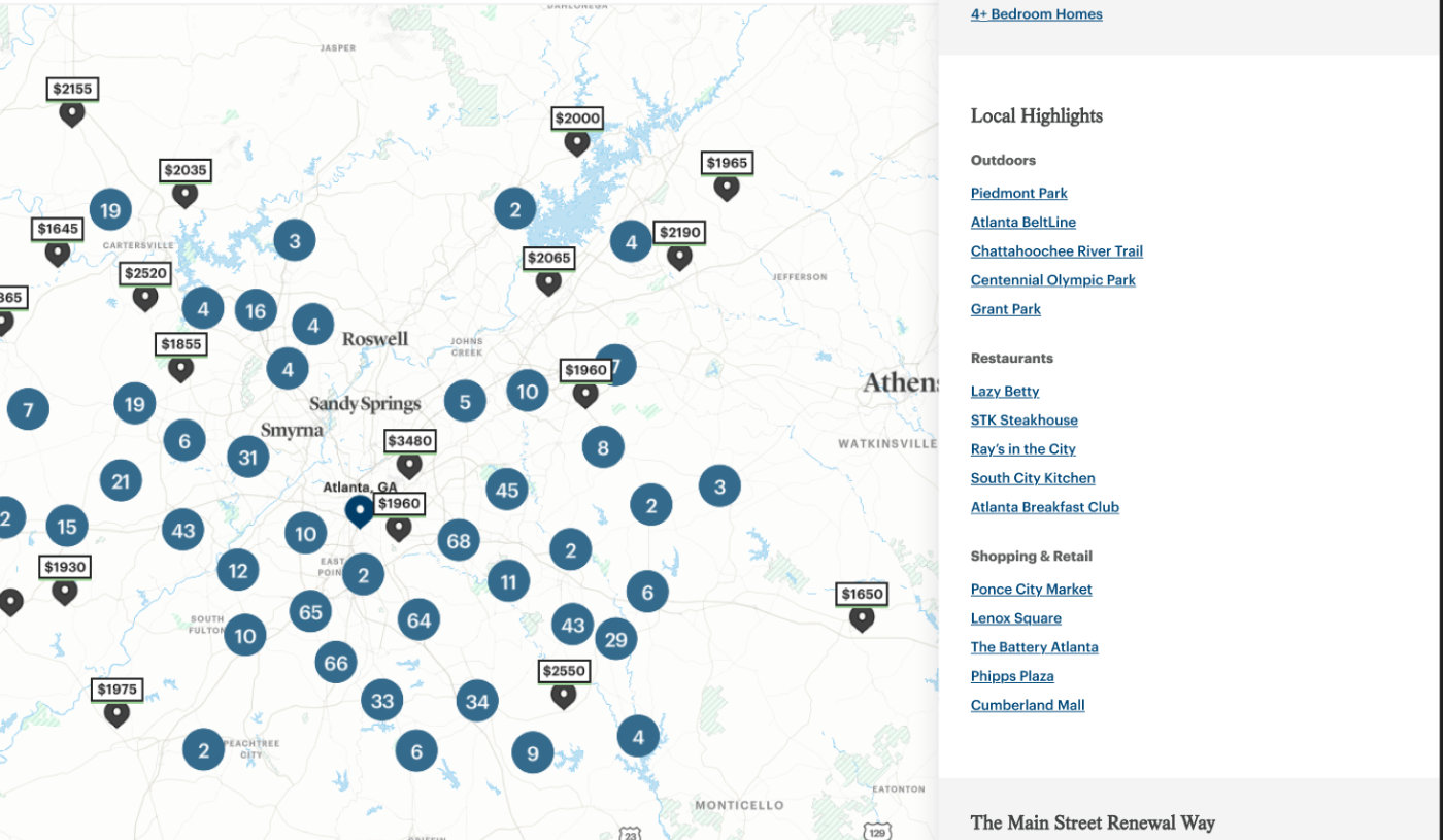
The existing experience did not consistently communicate the area being searched, so I recommended tying map behavior, location inputs, and displayed inventory tightly together. The changes answer one basic, consequential question: why am I seeing these homes?
Current experience
- City versus metro or market scope was ambiguous
- Map state and search state were not always clearly connected
- ZIP searches could make inventory look artificially sparse
- Renters could not easily understand nearby availability
- Search submission and autocomplete behaved inconsistently
Recommended model
- Visible search boundaries
- Clear location labels and result counts
- Persistence of the entered search context after results update
- Differentiation among city, address, market, and other location types
- Map exploration that broadens naturally through pan and zoom
02 / Decision
Let renters explore a region without forcing them to restart
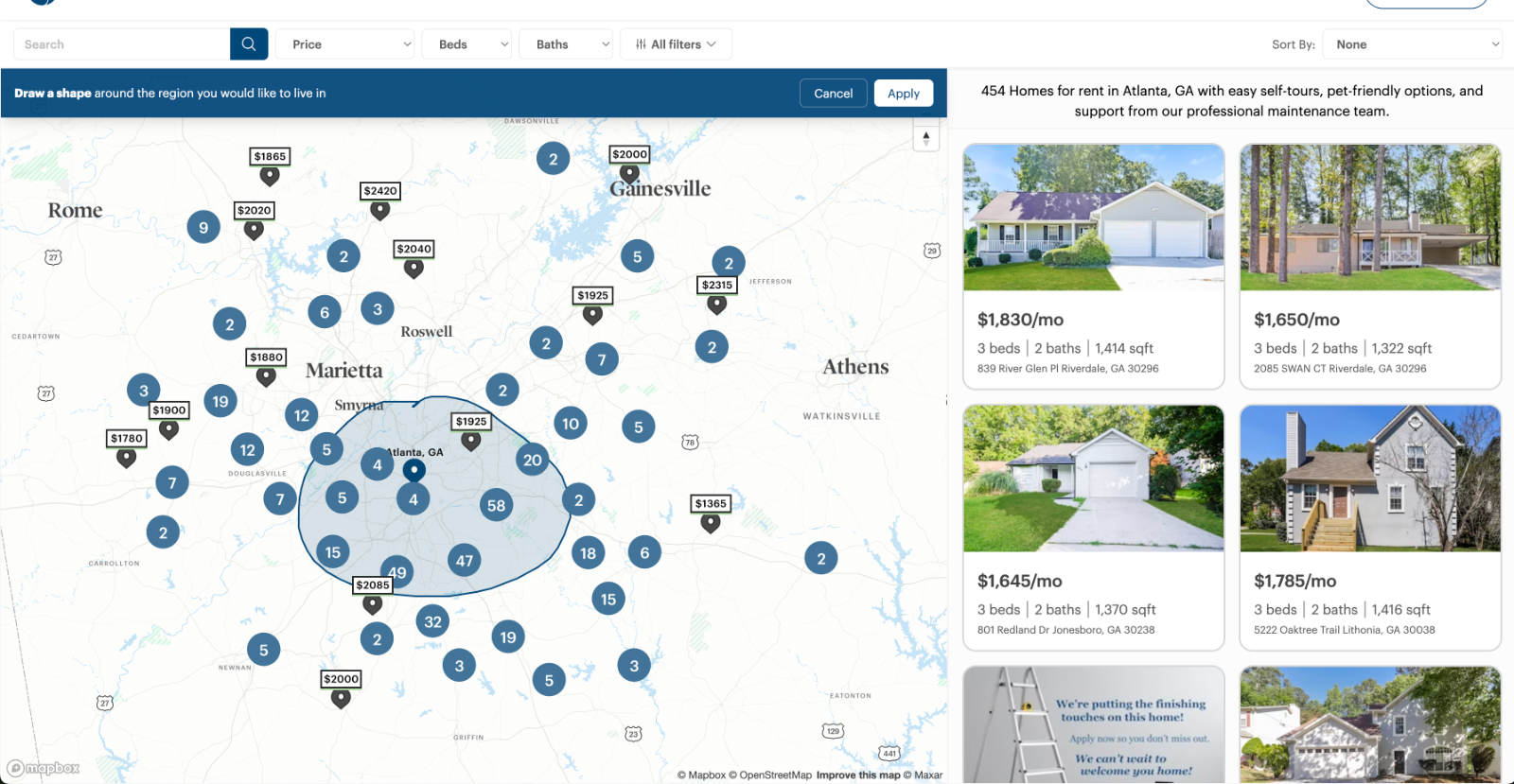
The behavioral signal was people moving among nearby locations inside a single session. People think in regions and commute zones. The interface required precise location inputs.
On mobile the problem compounded: valuable search and filter controls competed with the inventory they controlled, and filters lacked strong active states, so renters could forget which constraints were shaping their results.
My recommendation
- Drawable and adjustable geographic boundaries
- A full-screen mobile search takeover that keeps autocomplete available
- Map pan and zoom as a supporting exploration mode, with list-first scanning
- Query persistence after results update
- Recovery actions when matches run out: nearby homes, a wider area, or a saved search
- Visible applied-filter states and result counts with stronger hierarchy
My next-phase review of the POC
The core technical direction was strong. I identified the refinements that would make system status, recovery, and comparison clearer.
- {{ item }}
03 / Decision
Keep inventory primary, then add the confidence renters need
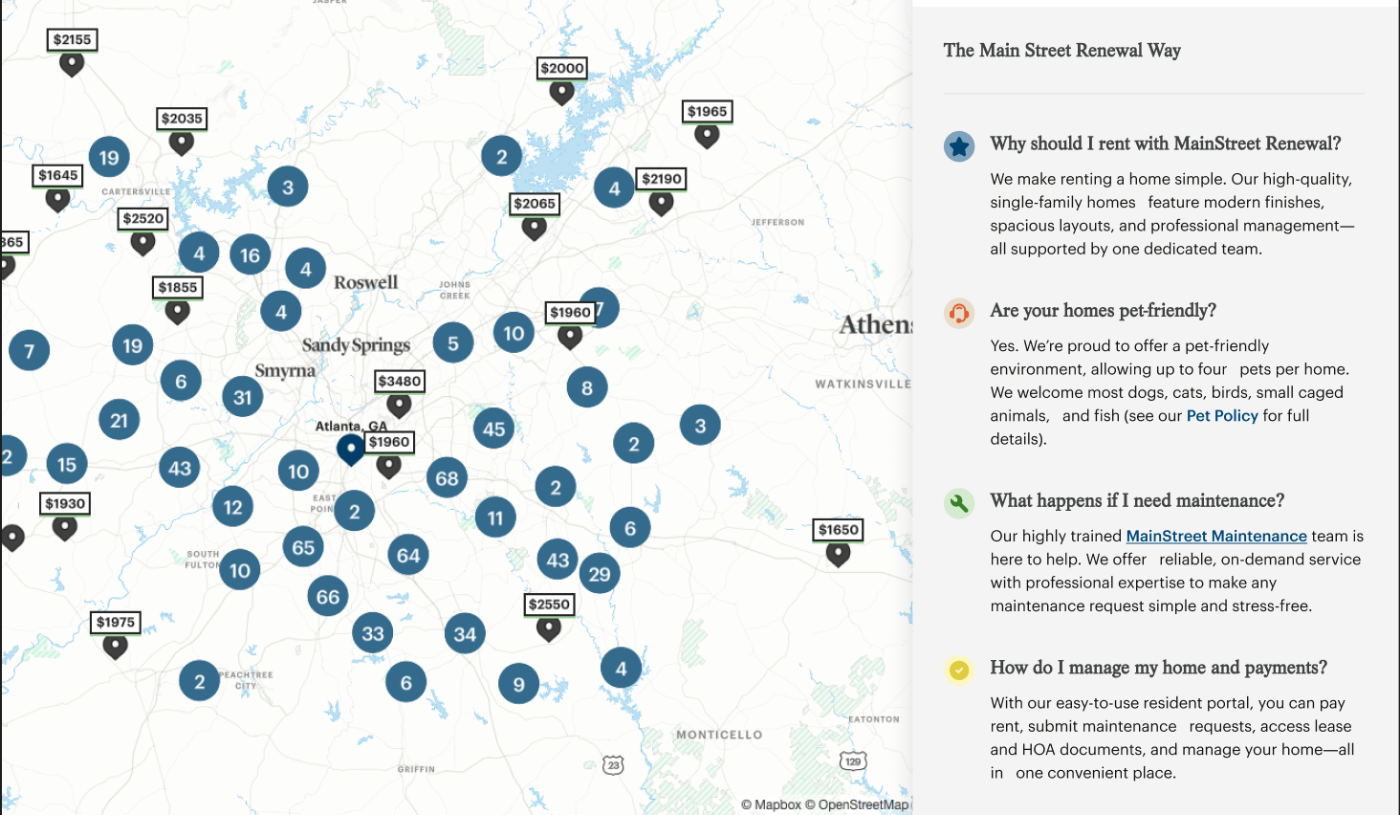
In the combined search and location concepts, inventory stays the dominant content. Supporting modules appear only after renters have had an immediate opportunity to browse homes. Editorial content does not interrupt rental browsing before people can see what is available.
- {{ step.n }} {{ step.label }}
Each module earns its place through a behavior
- {{ mod.label }}
- {{ mod.behavior }}
The same orientation problem existed in the navigation
Internal language
Markets
Renter language
Locations
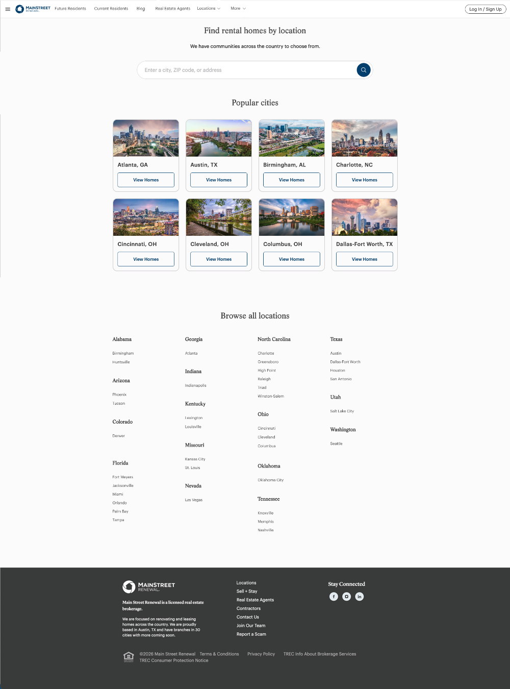
"Market" reflected the company's internal structure. "Locations" described what renters would actually find. But renaming a label was the small part. The value was a geographic information architecture that could scale to dozens of markets without crowding high-intent navigation: one Locations entry point, a short set of high-traffic cities, and a direct path to the full directory.

The locations page had one job: get people to inventory
I designed it as a routing page, deliberately not a marketing page. Three levels, in order of how directly they lead to homes.
- {{ level.n }} {{ level.label }} {{ level.note }}
I separated the experience strategy from the cost of implementing it
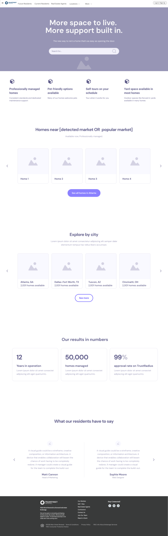
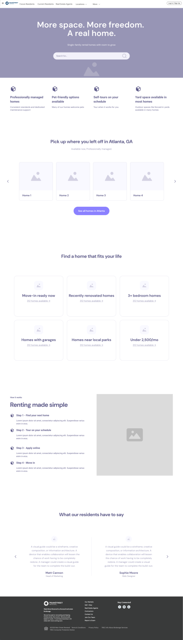
Both homepage concepts express the same strategy at different levels of development investment. Presenting them together let stakeholders evaluate the strategy without treating one implementation scope as the only possible answer. Both keep home search as the primary action, establish the company's value before asking visitors to browse deeply, and connect people more directly to available inventory.
Lower effort
Uses existing patterns more efficiently
- Search remains dominant
- Clearer hierarchy
- Stronger value proposition
- Location-aware inventory
Higher effort
Adds more guided discovery
- Move-in ready and recently renovated
- Bedroom count and garages
- Proximity to parks
- Affordability and other intent-led paths
The recommendations became a release strategy, not a backlog dump
Prioritizing against implementation reality is what made the findings actionable. Representative examples, not the full set.
{{ rel.label }}
- {{ item }}
SEO and engineering items in the wider plan were owned by collaborators. What I contributed here was the UX prioritization: which experience problems to solve first, and which could wait without holding up the rest.
The work moved off the slide deck
During the proposal presentation, the primary stakeholder began prompting the marketing and development teams to move toward implementation immediately. The client wanted to pursue nearly all of the recommendations.
- {{ step.n }} {{ step.label }}
What the launched experience shows
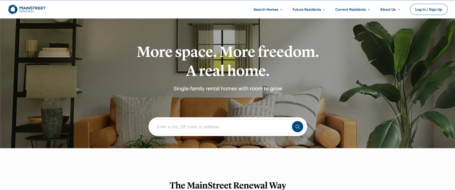
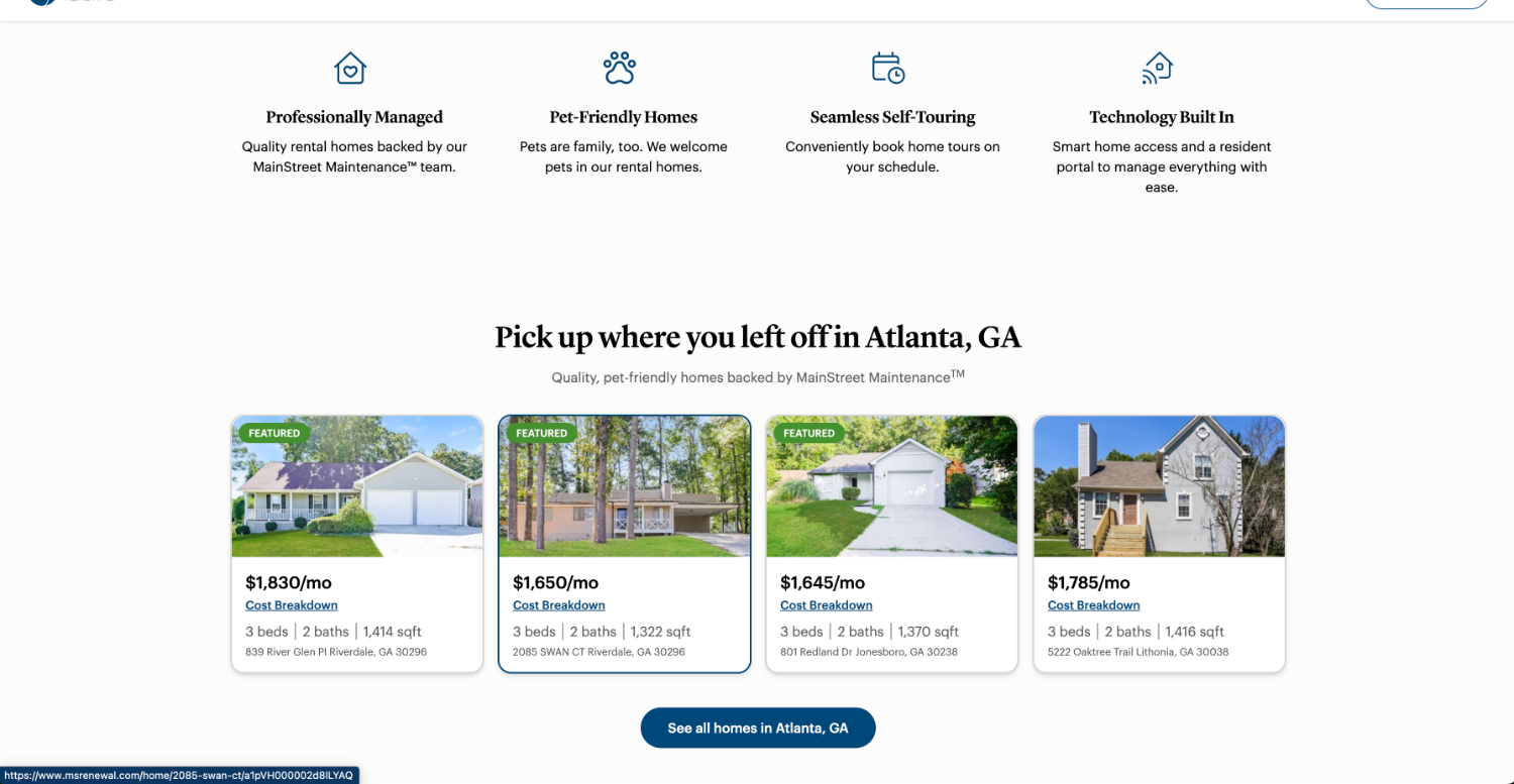
The client's internal product team built these screens. The supported conclusion is that the information architecture, homepage strategy, and UX direction substantially carried into the launched redesign, not that every module shipped as wireframed.
The strongest outcome was adoption
By the end of the engagement, behavioral evidence had materially changed what the client chose to build.
- {{ item }}
Evidence boundary
- Post-launch conversion data was not available to me. The client implemented the resulting experience through its internal team while I was on maternity leave.
- This case study therefore does not attribute a quantified conversion, occupancy, SEO, lead-generation, or revenue increase to the work.
- The nearly 60% figure is project-period audit data describing the problem, not a measure of improvement.
- The strongest documented outcome is adoption: evidence-based UX recommendations moved into the client's product and development work.
- The client is not named here. Project imagery appears as it was designed and built.
I would measure whether renters stay oriented while exploring
The audit also revealed inconsistencies in conversion tracking, so measurement quality was part of the product problem. With post-implementation access, these are the questions I would put to the data. None of this has happened yet.
- {{ item }}
I would pair the analytics with moderated usability research to learn whether renters correctly understand geographic scope, active filters, and inventory availability.
The breakthrough was treating the journey as a system
The most important decision was resisting the urge to treat each page as a separate optimization problem. Search, navigation, location content, and listing pages looked like separate opportunities. Behavior showed they were connected: renters wanted to remain oriented while exploring a complex and changing inventory.
Good conversion strategy does not pressure people forward. It gives them the clarity and confidence to keep moving.
Working through a similar kind of complexity?
I’m interested in senior UX roles where research and design shape consequential product decisions.
Next: De-risking a navigation overhaul with research and post-launch evidence · Atlanta Beltline · Research strategy · IA · measurement