Small-business lending company · Information architecture · Product design
Unifying two lending experiences around how customers actually choose
A small-business lender was preparing to bring a separately branded retail lending site into its primary brand while modernizing a website that had to serve two very different audiences: small-business owners seeking capital and financial partners submitting deals.
I led the UX strategy and information architecture. I reframed the site around customer intent rather than internal business lines, then translated that strategy into the complete sitemap, a new navigation system, the homepage flow, and wireframes for every templated page type. The architecture and UX direction carried into the launched redesign.
- Role
- Senior Experience Designer
- Duration
- Approximately one month of active UX work, plus content-entry support near launch
- Focus
- UX strategy · information architecture · navigation · homepage strategy · wireframing
- Outcome
- Architecture and UX direction implemented in the launched redesign
Many products, one decision surface
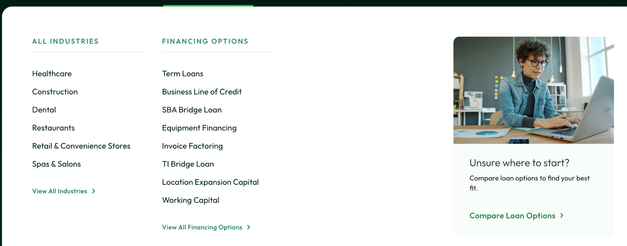
Industries, use cases, financing products and a guided route for the undecided, held inside one navigation hierarchy.
The 60-second version
- The problem
- A small-business lender needed to bring a separately branded retail experience into one website without confusing small-business owners and financial partners with very different goals.
- I owned
- Stakeholder discovery, heuristic evaluation, competitive research, UX strategy, complete sitemap, homepage content strategy, navigation system, and wireframes for every templated page type.
- The pivotal decision
- Organize financing around how customers actually seek it: by industry, business need, or known product, while giving financial partners their own faster task-oriented route.
- What changed
- The proposed architecture and UX direction carried into the launched redesign, creating a more scalable foundation for products, industries, resources, conversion journeys, and future campaigns.
My scope
I owned
- Stakeholder-interview participation
- Heuristic evaluation
- Competitive research
- UX strategy
- Information architecture
- Complete sitemap
- Homepage strategy and content flow
- Primary navigation and mega-menu system
- Wireframes for all templated page types
- UX rationale and handoff
- Content-entry support near launch
Collaborators
- UI designer
- Creative lead
- Content strategy
- SEO
- Demand generation
- Client product stakeholders
- Client engineering stakeholders
Authorship boundary
I owned the UX architecture and wireframes. The UI designer translated the approved UX direction into the final visual system, so launched screens on this page are labelled as the launched experience rather than my visual design.
The redesign problem was really an architecture problem
The company funds small and midsize businesses through direct lending and through a network of brokers and other financial partners. Its retail lending business ran on a separate brand and website, and that experience was being folded into the primary brand.
Small-business owners usually start with a need: covering payroll, buying equipment, managing seasonality, funding a remodel. Partners arrive with far more domain knowledge and a different set of tasks, such as submitting a deal, reviewing program information, or reaching a portal.
The existing experience reflected the company's internal structure more clearly than its customers' mental models. Combining the content without a new organizing model would have produced two businesses stitched together.
Experience A · direct retail lending
Product-first navigation. Financing options compete for attention on the homepage.
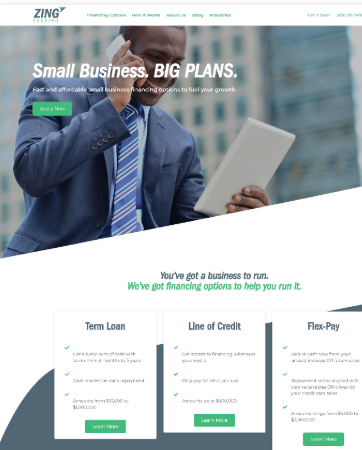
Experience B · primary brand, partner ecosystem
Attribute-first navigation. A partner call to action sits in the hero, ahead of borrower tasks.

- {{ item }}
The challenge wasn't making two sites look alike. It was finding one organizing model that could serve both.
Experience A
Direct retail lending
A separately branded site speaking to business owners in product language, with its own navigation, campaigns, and conversion paths.
Experience B
Primary brand, partner ecosystem
The parent site built around brokers, referral partners, and program information, where borrower content sat second.
One future experience
A shared system with intentional routing
One brand, one hierarchy, and deliberate moments where each audience is pointed toward the route meant for it.
The architecture changed when I stopped asking customers to speak lender
The company needed to expose the breadth of its offering without asking visitors to understand its internal lending taxonomy first. That produced the principle the whole structure follows.
Let people enter through the language they know, then help them understand the product that fits.
-
{{ mode.knows }}
{{ mode.route }}
Four entry points, one hierarchy. Nobody has to translate a business problem into a financial product name before the site can help.
01 / Decision
Support three customer mental models in one navigation system
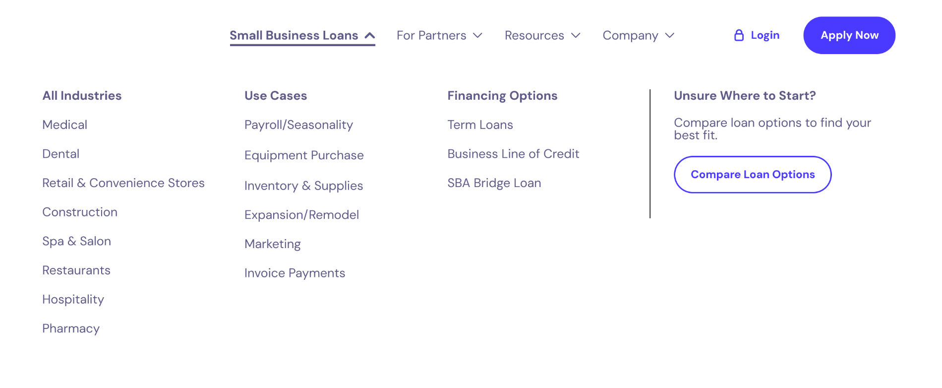
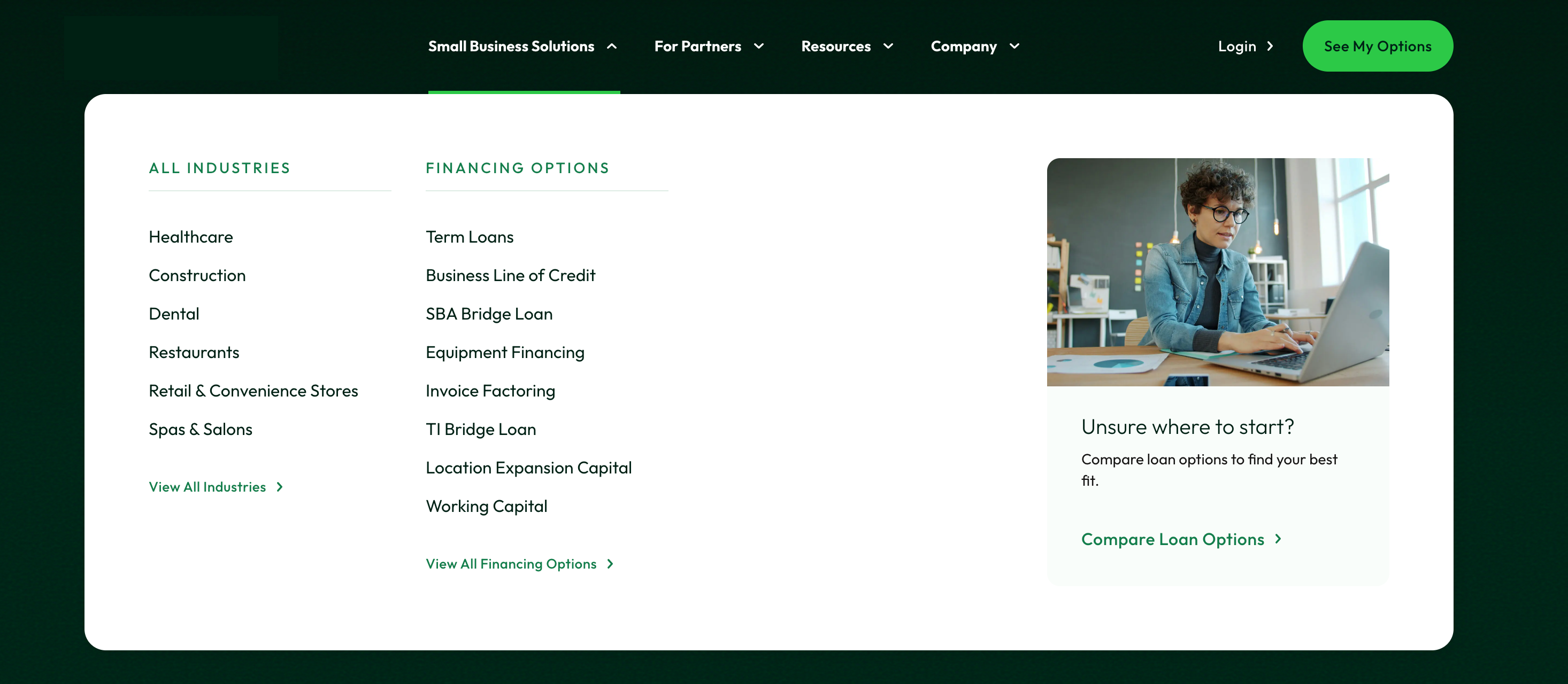
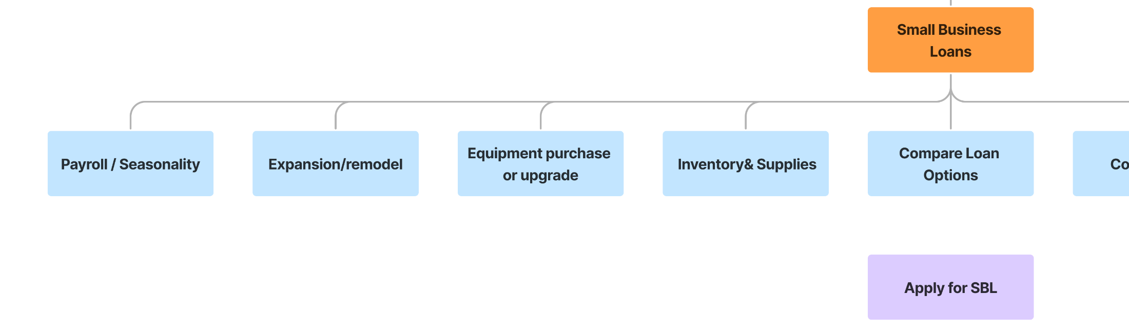
Some visitors browse by industry. Others recognise a use case such as payroll, inventory, or expansion. Experienced borrowers already know they want a term loan or a line of credit. I brought those entry points together inside a single Small Business Solutions menu, with a guided comparison path for anyone unsure where to begin.
Evidence
Customers could approach financing through different levels of knowledge.
Interpretation
Forcing everyone into a single product taxonomy would privilege experienced borrowers and make less-experienced visitors translate their problem before getting help.
Decision
Expose multiple customer-centered entry points while preserving one coherent hierarchy and a guided route for uncertainty.
The menu as a conversion surface
Every menu pairs findability with one contextually relevant action rather than a wall of competing calls to action.
Section content
paired with
One relevant next step
02 / Decision
Two audiences needed intentional routes, not two separate websites
Borrowers often need orientation, comparison, proof, and industry relevance before they are ready to apply. Partners arrive task-oriented. Treating them as one generic audience would create ambiguity; splitting them into disconnected sites would undo the consolidation.
Route A
Small business
- Discover
- Compare
- Understand
- Apply
Route B
Financial partner
- Identify the program
- Submit or refer a deal
- Register
- Reach the portal and resources
Both routes rejoin under one shared brand system, navigation, and page architecture.
Diagram recreated from my documented architecture. The launched partner menu is internal material and is not reproduced here.
03 / Decision
The homepage had to route, reassure, and then educate
The homepage could not be a catalog of everything the company offered. I gave each stretch of the page one job in the decision journey, so the highest-value actions stayed visible while borrowers who needed orientation first could still get it.
-
{{ stage.label }}
{{ stage.note }}


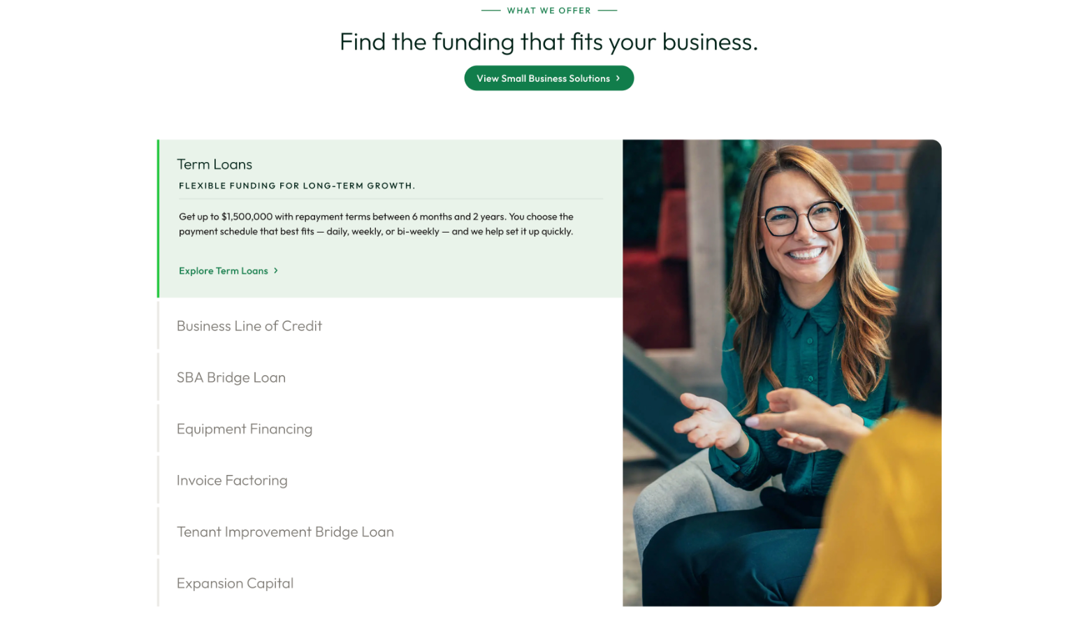
I placed the loan calculator after the primary decision and orientation points rather than at the top of the page. Useful interactive tools should support a decision without pulling attention from visitors who are already ready to act.

“This refresh is more than a new look. It’s a reflection of who we are today and where we’re headed. Our new brand and website better represent [the company] as a modern, forward-thinking lender that’s continually investing in smarter technology and better experiences for our partners and the small businesses they serve.”
“Our brand should work as hard as our technology does. This new website and application create a stronger foundation for what’s coming next; from deeper platform capabilities to new features designed to support sustainable growth for our partners and borrowers alike.”
The sitemap became a shared model the rest of the team could build from
Two experiences became four top-level territories, each with a clear owner in the business and a clear job for the visitor. The structure is deliberately shallow so products, industries, and resources can be added without renegotiating the navigation.
-
{{ branch.label }}
- {{ child }}
The architecture had to scale beyond the homepage
I wireframed every templated page type in the redesigned site. Three of them carry the system: an industry page, a product page, and the discovery page where undecided visitors compare options.
-
{{ tpl.kicker }} {{ tpl.label }} {{ tpl.note }}
One architecture reusable page types implementation the team could extend
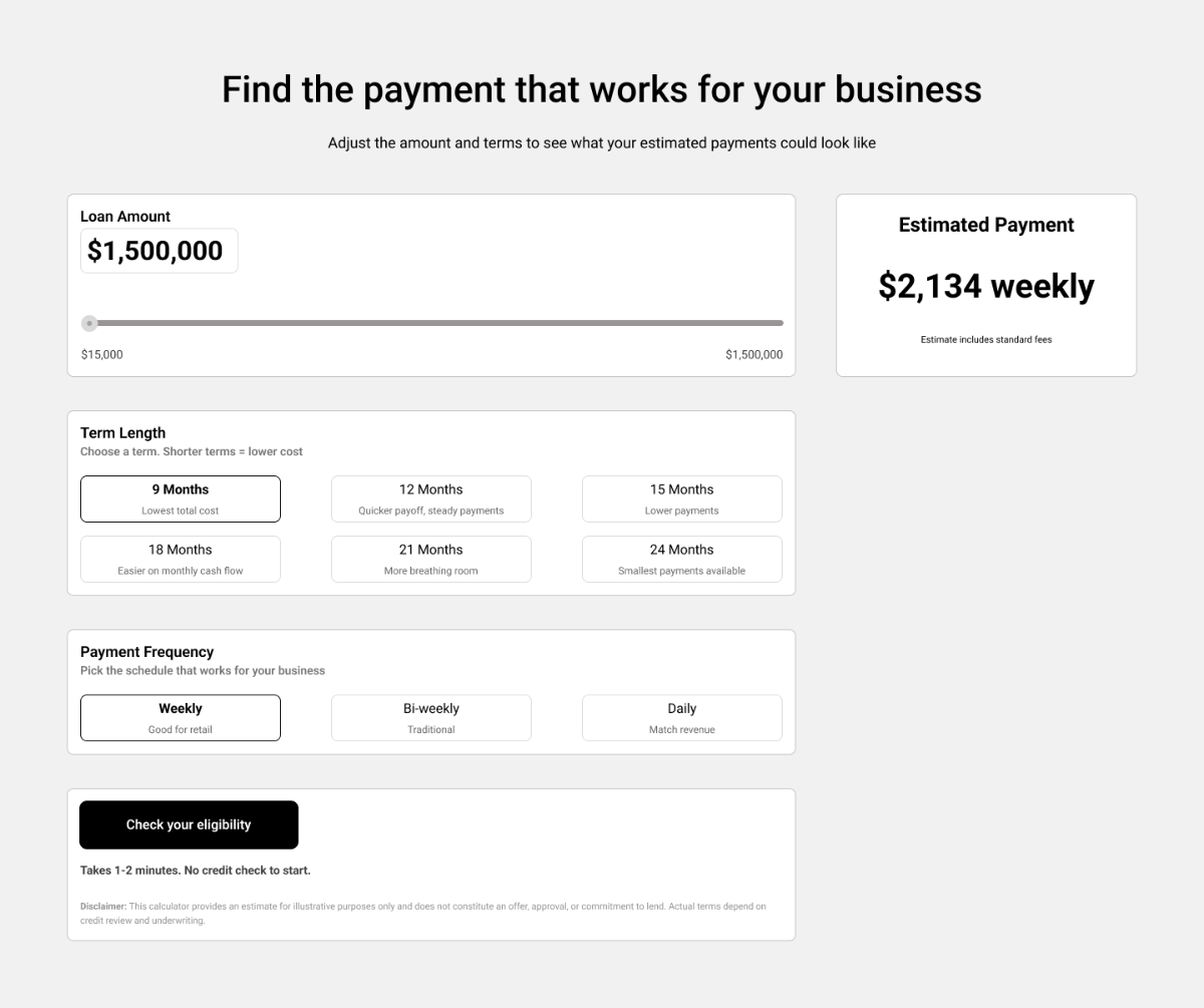
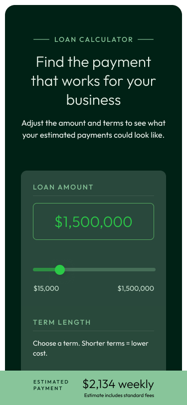
The system also had to hold together at interaction level
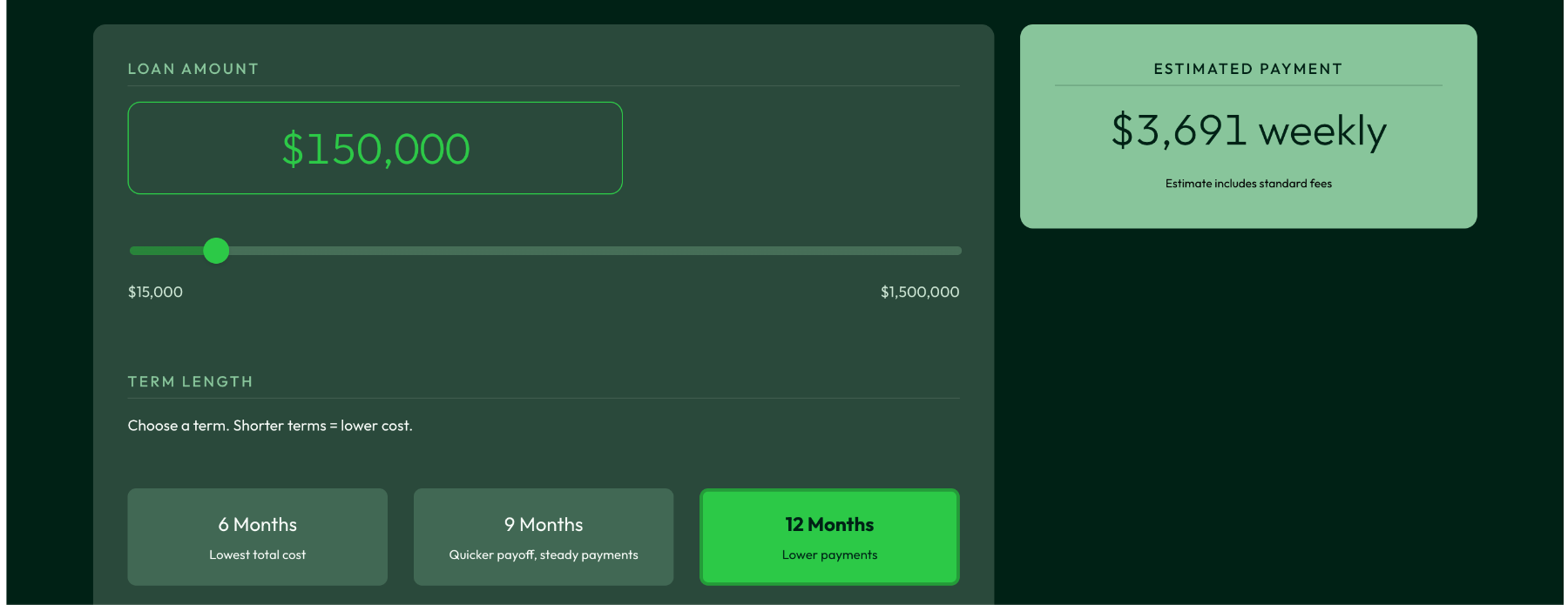
The loan calculator is the one place on the site where a visitor manipulates the product directly. Amount, term, frequency, and estimated payment all have to stay understandable together, on a phone as much as on a desktop.
The architecture became the foundation of the launched redesign
- The architecture and UX direction were implemented in the launched redesign
- The direct and partner experiences were brought into one shared system
- The structure supported product, industry, resource, and conversion journeys
- Client response to the launch was strongly positive
Client response
Client leadership responded enthusiastically to the launched experience, with internal launch feedback describing it as elegant, fast, and modern.
Evidence boundary
- No verified post-launch conversion, SEO, lead-quality, or application-completion metrics are available.
- The strongest supported implementation outcome is that my architecture and UX direction carried into the launched redesign and received strong client feedback.
- Qualitative launch feedback is not measured product impact, and not every final screen reproduced each wireframe exactly.
- The client is not named here. Project imagery appears as it was designed and built.
I would measure whether the new structure helped people choose the right path
With post-launch access, these are the questions I would put to the data. None of this has happened yet.
- Correct-path selection between borrower and partner audiences
- Navigation engagement by industry, use case, and financing type
- Starts and completions for borrower conversion flows
- Starts and completions for partner flows
- Guided comparison usage among undecided visitors
- Qualified-lead rate by landing path and acquisition source
- Search behavior and failed-navigation patterns
I would pair the analytics with moderated usability testing to learn whether small-business owners understood the differences among financing options, and whether partners could reach high-frequency tasks without detours.
Information architecture is business strategy made visible
The hardest part was not arranging links or modules. It was deciding how a company with multiple business models should present itself to people who do not share its internal vocabulary.
By grounding the structure in customer intent, I created a system that supported immediate conversion needs and a broader organizational consolidation at the same time.
Working through a similar kind of complexity?
I’m interested in senior UX roles where research and design shape consequential product decisions.
Next: Reframing property search to capture more renter intent · National single-family rental platform · UX strategy · moved into development