Georgia Aquarium · UX + interaction design · CMS workflow
Turning a static schedule into a responsive visitor-and-publishing system
I evolved an inherited concept into a launched schedule that connected visitor planning, responsive behavior, content authoring, operational exceptions, and future-date recovery.
- Role
- UX and interaction design
- Duration
- Approximately one month
- Scope
- Schedule UX · responsive behavior · CMS workflow · visual refinement · developer annotations
- Status
- Launched substantially as designed
Authorship
I owned or substantially evolved
- {{ item }}
Starting point
An initial schedule design existed before I took over the experience. I substantially evolved it as the interaction and operational requirements became clearer.
Development
Developers owned technical implementation and the heavier recurring-event logic. I defined the intended authoring behavior, the user-facing states, responsive behavior, and the implementation requirements.
The problem was bigger than replacing a PDF
Georgia Aquarium's daily programming had been published through a manually maintained PDF. Visitors needed to know what was happening, when it started, where it took place, whether it required a reservation, and whether operating conditions affected their plans.
But the replacement also had to work for the people maintaining it. A schedule this active could only stay accurate if publishing it was practical.
Visitors
- {{ n }}
Content authors
- {{ n }}
The public interface and the publishing workflow were one design problem, not two.
01 / System decision
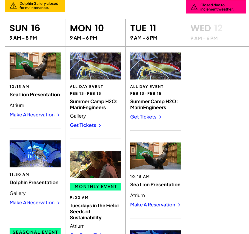
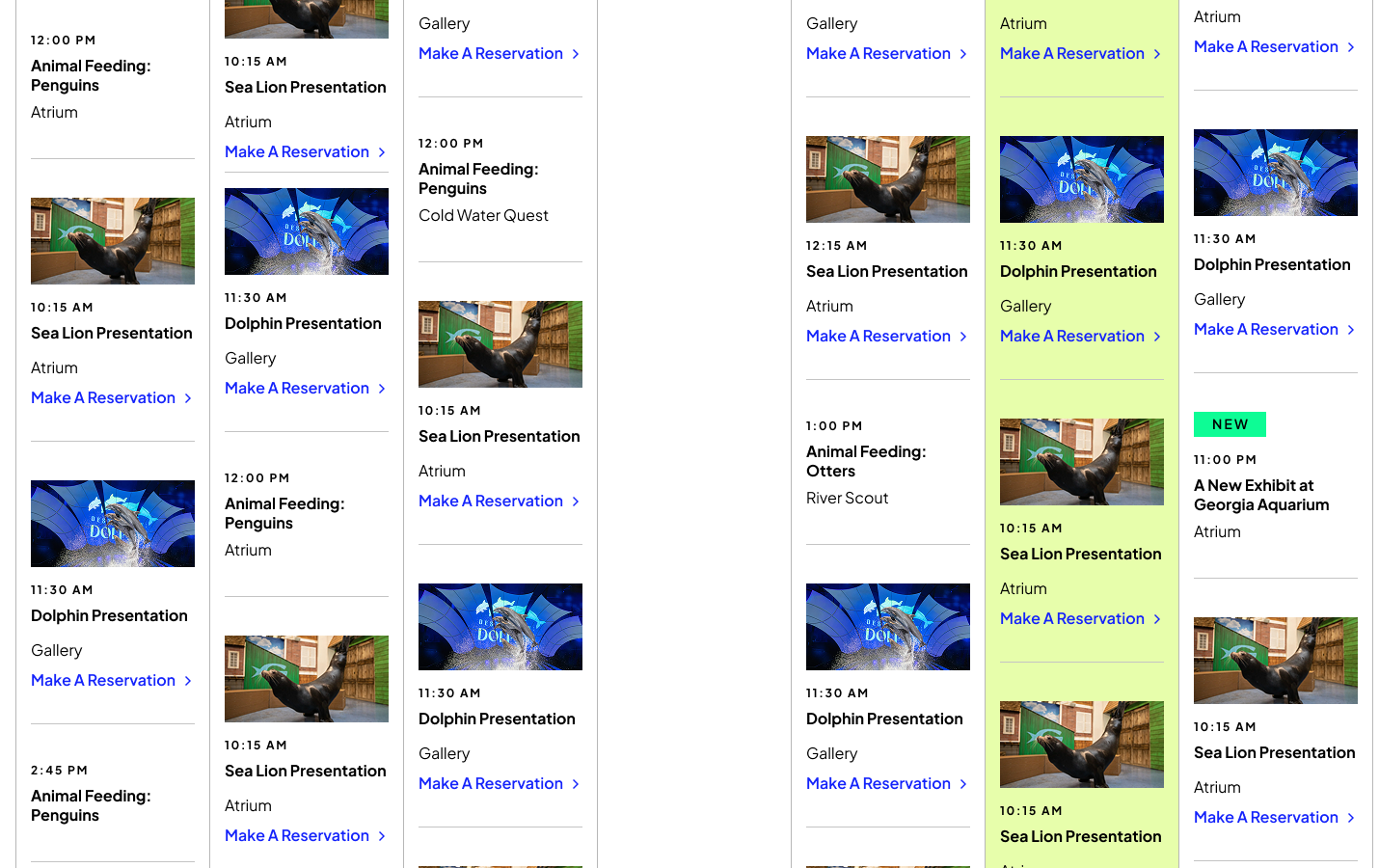
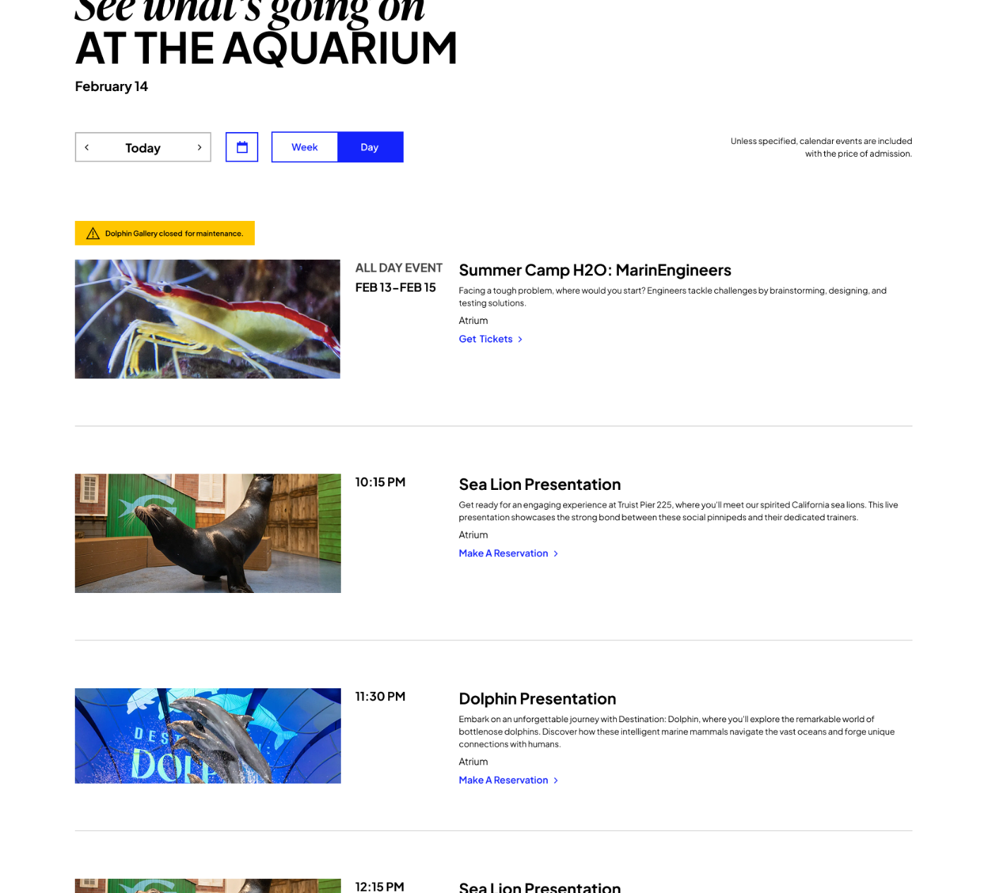
Design one information hierarchy that works by day or by week
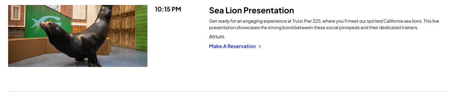
The same content model needed to support two different planning depths without becoming two unrelated experiences. Week and day are not a display preference; they answer different questions, so each view promotes a different part of the same event record.
- {{ u }}
- {{ u }}
02 / System decision
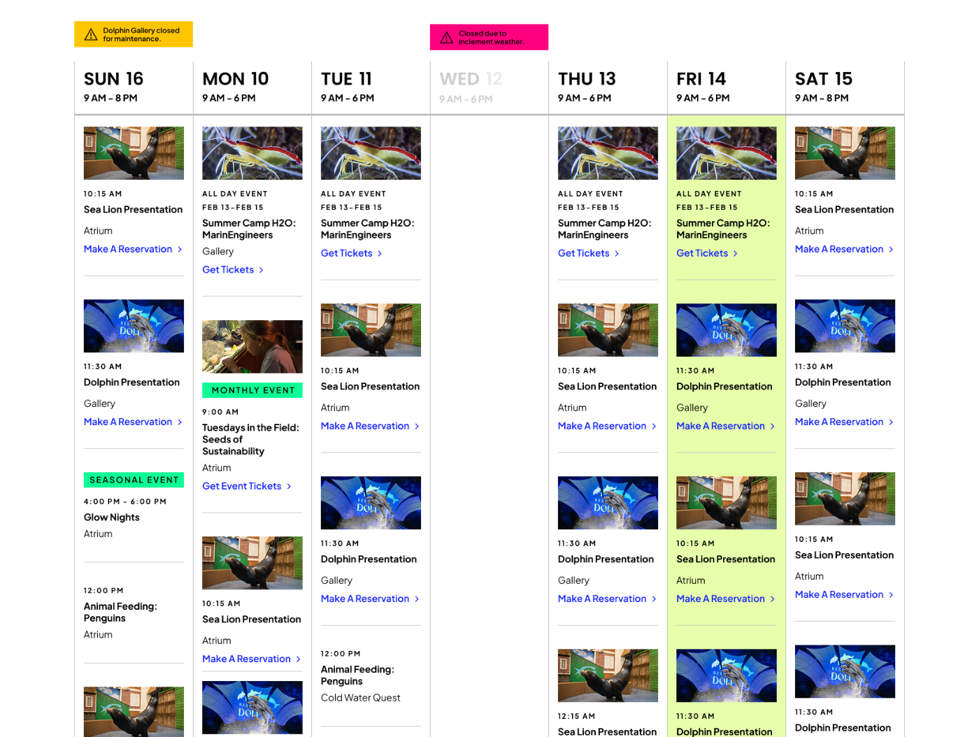
Operational changes had to live inside the schedule, not beside it
A destination schedule has to absorb exhibit closures, late openings, early closings, date-specific and seasonal events, and programming that requires a reservation or a ticket. Each of those belongs to a specific day, so the notice stays attached to the day it changes rather than sitting in a banner a visitor has to find first.
- {{ a.kicker }} {{ a.label }} {{ a.note }}
03 / Edge case
An empty future schedule should not look like an empty aquarium
When a visitor selected a date beyond the completed programming calendar, showing nothing would have communicated the wrong thing. The real state was not that nothing was happening. It was that the detailed schedule had not been published yet, and the visitor needed help interpreting that.
- The data state No published daily programming yet
- Is not No experience available
- So the state does Set expectation, then offer the next step
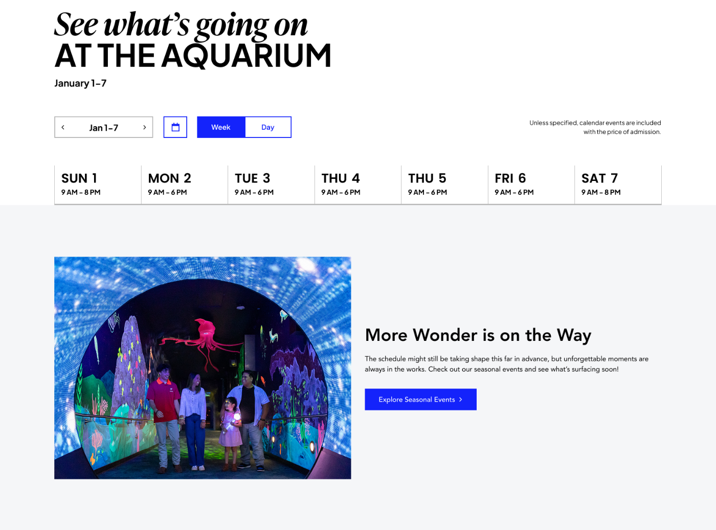
More Wonder is on the Way
The schedule might still be taking shape this far in advance, but unforgettable moments are always in the works. Check out our seasonal events and see what's surfacing soon.
This is the judgment I would point to first in this project. It is not an empty state. It is a publishing state, and the visitor deserved an accurate reading of it.
The visible schedule was only half the design
I also defined how the system should behave for the people publishing it: recurring programming, one-time events, operational notices, schedule exceptions, and dates where detailed programming had not yet been entered. I created backend wireframes and implementation guidance so development understood what the authoring system needed to support. Developers owned the underlying technical logic.
Author defines
- {{ d }}
Public schedule renders
The appropriate day or week state, including notices, event-type labels, action requirements, and the future-date state when nothing has been published.
A conceptual behavior model drawn from documented requirements. It is not a representation of the aquarium's CMS interface.
Mobile was a planning context, not a scaled-down desktop
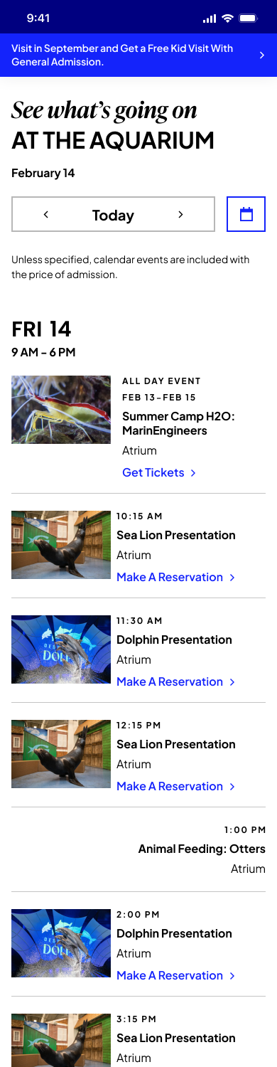
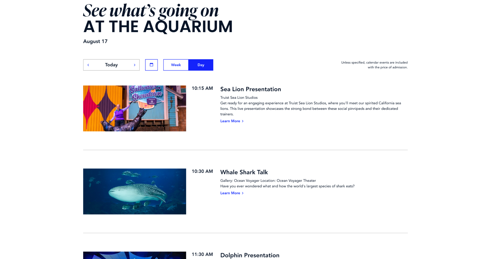
Visitors use the schedule on site, mid-visit, deciding what to do next. On a phone the time is the thing being scanned, so the hierarchy inverts: time first, imagery last, action attached to the event.
- {{ d.label }} {{ d.note }}
Implemented experience · launched substantially as designed
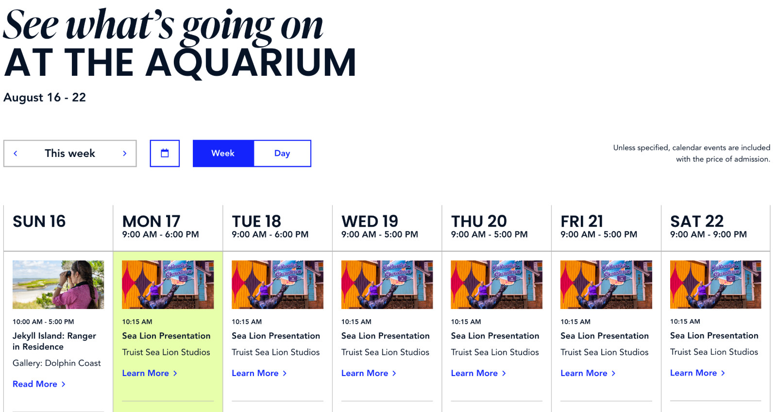
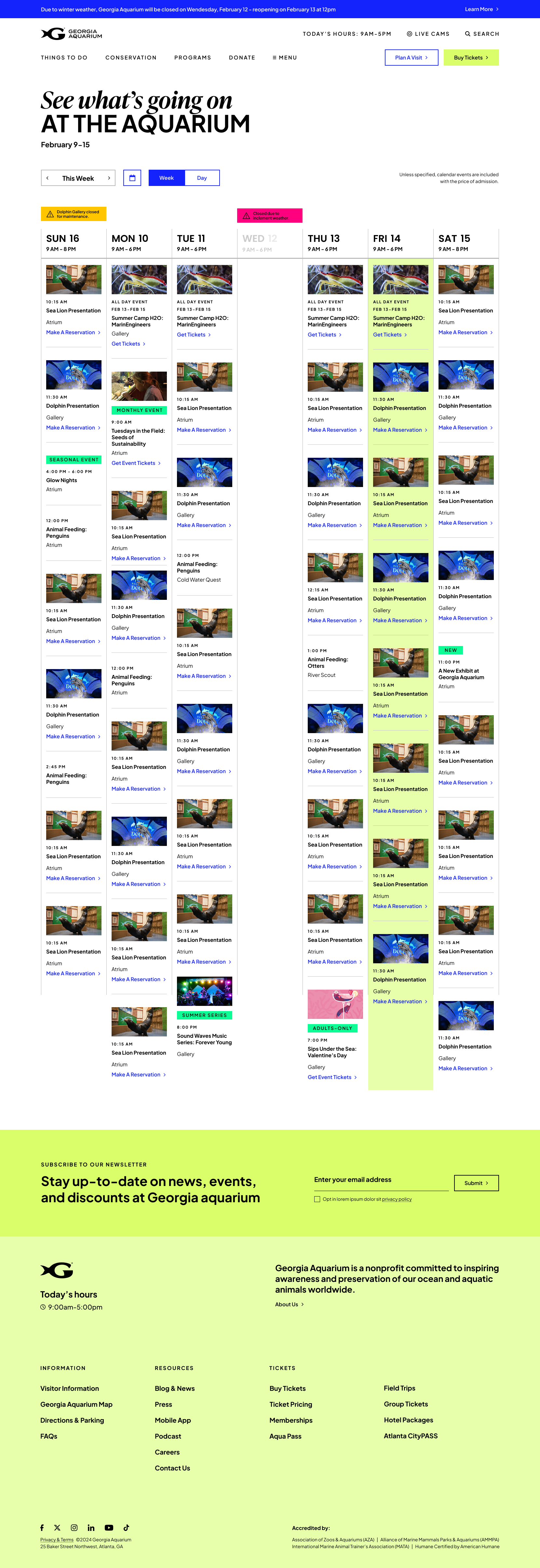
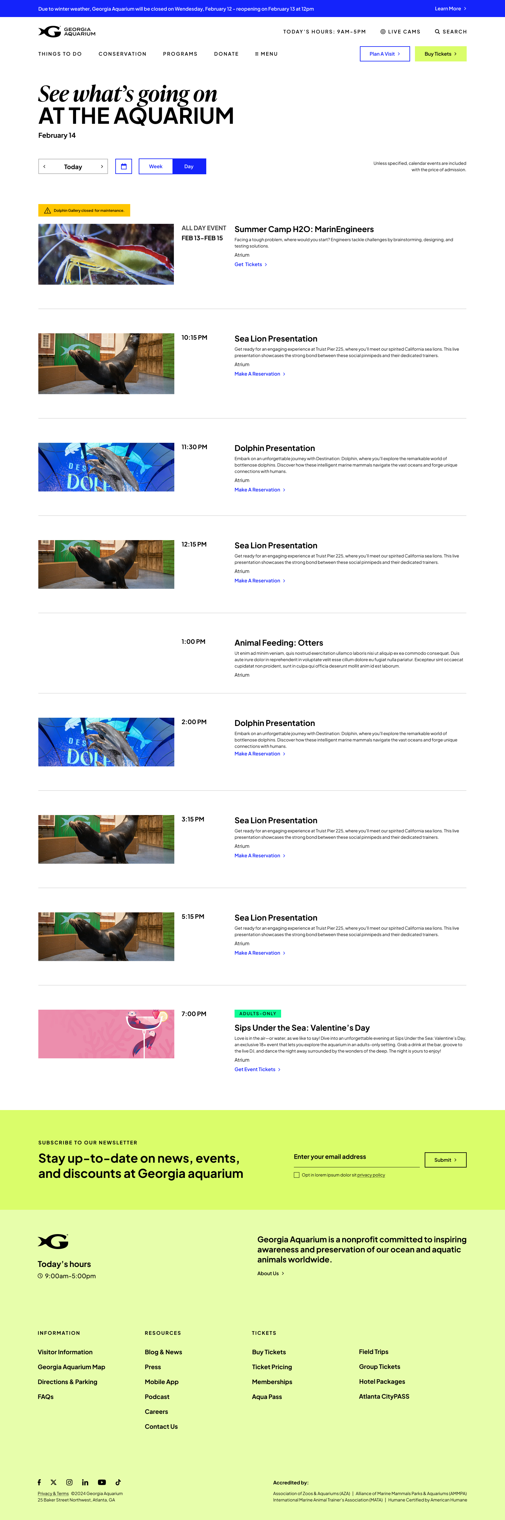

The system launched and replaced the static PDF
- {{ o }}
The result was not simply a better schedule page. It was a maintainable planning system designed for both the people using it and the people keeping it accurate.
{{ s.label }}
{{ s.note }}
I also contributed video editing to the aquarium homepage, drawing on my earlier film background.
Working through a similar kind of complexity?
I’m interested in senior UX roles where research and design shape consequential product decisions.
Next: Rebuilding an enterprise conversion program on evidence · Enterprise software · AI-assisted testing · 10.8% → 18.3%