CASE STUDY
Redefining B2B Order Tracking: Modernizing Design Standards for Usability and Growth
An interface update to a customer-facing eCommerce order tracking platform leads to improved customer value through data visualization and more intuitive order tracking and operational efficiency through design system implementation.

Activities
UX Audit, UI redesign
Tools
Figma
Project Type
Design System, SaaS redesign
Background
Smurfit WestRock is a global leader in packaging solutions with over 100 years of history, 50,000 employees, and more than $20 billion in revenue. As part of its commitment to innovation and customer satisfaction, the company embarked on a digital transformation journey to modernize its platforms and better serve the increasingly technology-savvy customer. According to previous CEO David B. Sewell, "Our focus on digital transformation is essential to enhancing our customer experience and driving operational excellence."
The Customer Digital Portal (CDP) is a tool for our enterprise customers to track their product orders and view order history, akin to Amazon.

Legacy landing page for the Customer Digital Portal (CDP)
The Problem
This outdated platform lacked the functionality that modern users expect, frustrating customers and overtasking CSRs
Low adoption by customers of this portal meant that customer’s were relying on customer services representatives (CSRs) for any and all information on their orders, causing high call volumes.
📞
Essential features like data visualization, comprehensive order history, and clear order information were missing or insufficient.
🚫
🕰️
The portal did not align with contemporary design standards and was not integrated with our design system, leading to a subpar and inefficient user experience and increased development spend.
Goals
The primary objective was to modernize the Customer Digital Portal (CDP) by aligning its user interface with current design standards and integrating it with the Design System. This effort aimed to create a seamless, efficient order tracking experience that increases user adoption while alleviating the workload of overburdened customer service representatives.
This work was primarily a jumping-off point to explore a future state of what could be possible with the CDP platform before determining minimal viable product (MVP) features for a ‘crawl’ phase implementation.
My Role
I led the UX audit of the existing platform, identifying usability issues and gaps in alignment with user expectations, and spearheaded the redesign of key CDP functionalities, including the dashboard, product details, and order tracking.
Over a one-month period, I worked closely with the lead eCommerce UX designer and the Design System lead to explore user expectations and iterate on new design patterns. I facilitated and led design critiques with the UX and product teams, incorporating feedback to ensure the redesign aligned with both user needs and business goals.
Process
The process for this redesign included eCommerce heuristic research and multiple touch points with fellow UX designers, including daily check ins asynchronously with the lead eCommerce designer and lead Design System designer via Figma and Teams, and weekly presentations to the UX team writ large for discussion and critique via Teams meetings.
Solution
Order List
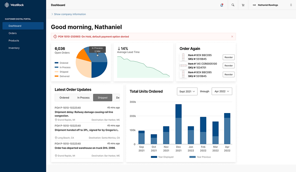
The Dashboard

-
Lost sale opportunity: There is a lost opportunity to cross-sell, or offer a frictionless way to re-order previously ordered product.
-
Out of context metrics: All metrics shown do not provide much meaning or usefulness to customers on their own.
-
Metrics take up more space on the page than necessary: The metrics shown take up a lot of screen real estate unnecessarily, a lost opportunity to not only offer the customer more valuable information, but prove the usefulness of the platform.
-
Useless documents icon: With several thousands of documents, this icon does not accurately communicate what documents will be found once clicked and will likely not take the user right to the document they are in need of.
Order List


-
Insufficient order status at a glance: The most prominent question customers have about their orders is where it physically is on the journey to them.
-
Excessively tall columns: With the average volume of orders being very high for the average customer, this added white space sacrifices a faster scroll.
-
No sorting functionality: Users lack the ability to manipulate the order list by sorting the rows in ascending or descending order, as PO# might have little relevance to users who have their own non-Westrock PO# for orders.
Order Details


-
Customer-Centric KPIs Are Not Prioritized: From a customer's perspective, they likely care most about current status, quantity shipped vs. ordered, and when to expect delivery—yet these insights are small and buried.
-
Missing Visual Hierarchy for Key Details: All fields use the same text weight and spacing, making it hard to scan. Important groupings (e.g., billing vs. shipping info) are not visually differentiated, and there's no alignment grid or logical chunking to guide the eye. This forces users to read every label instead of quickly finding what they need.
Outcomes
The designs of this project significantly shaped the design system standards for tables, addressing WestRock's complex data presentation needs. Drawing on extensive research of established systems like Microsoft's Fluent and Apple's human interface guidelines, I developed scalable solutions that met current requirements while anticipating future use cases.
This project also served as a testbed and evangelist of the design system within the organization, illustrating its potential to product managers and stakeholders less familiar with what a design system is, and what it is capable of.
While eCommerce and B2B usability best practices were maintained throughout the design process, I emphasized that incorporating the user's voice would be essential before moving any designs toward implementation. Although I transitioned to a new team before testing or implementation could take place, the design outputs and UI components I developed provided a strong foundation for future usability testing and informed prioritization.